FITI / Mobile product design / 2026
Making combined exercises easier to follow.
FITI helps gym members follow workouts assigned by their trainers. This project focused on combined exercises: movements performed together as part of a prescribed routine.
The challenge
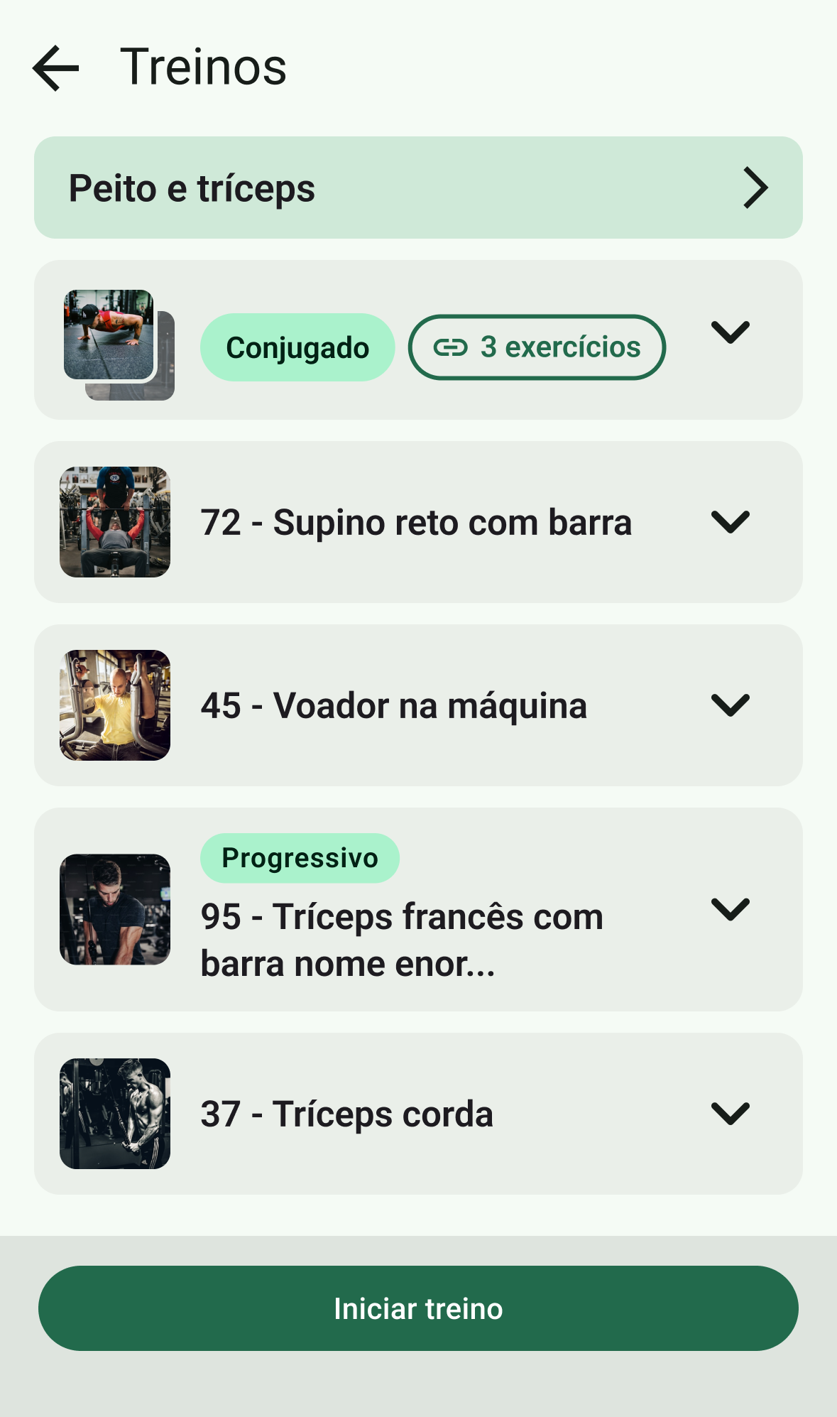
The list already included a combined-exercise label, exercise count, and header thumbnails. Interviews revealed that these cues were not enough: gym members did not consistently recognize the headers as the beginning of distinct movements within the group.
The objective
Help gym members understand what comes next, when to rest, and how to access each exercise demonstration directly from the workout list.
My role
As FITI's main mobile app designer, I led the work from research and design critiques through prototyping, component updates, and developer handoff.
Where the structure broke down
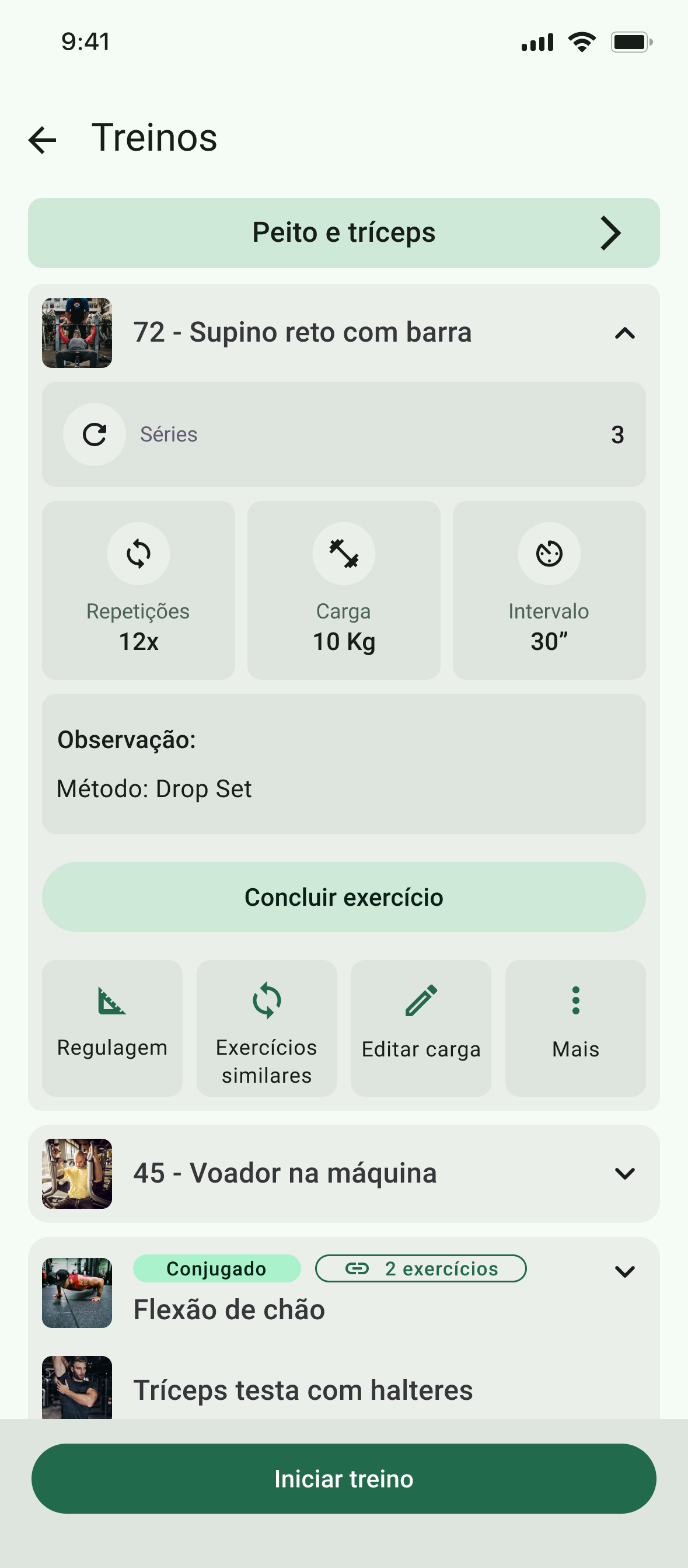
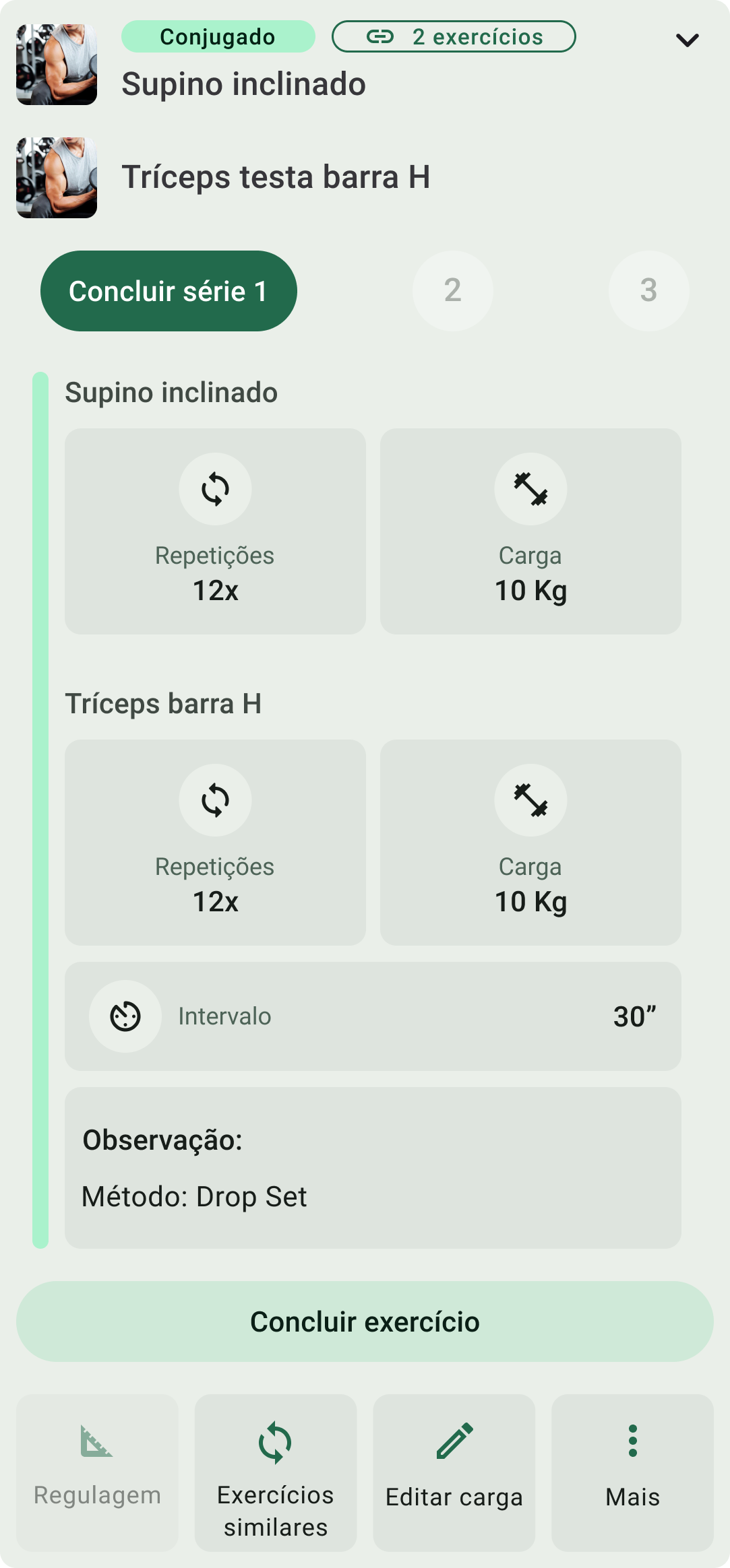
- Exercise names were separated from their repetitions and load.
- The header imagery did not provide a clear media entry point for each movement.
- A shared interval left the sequence and rest timing open to interpretation.
A list of exercises is not the same as a workout sequence.
The previous flow assumed people would finish all sets of one exercise before moving on. In practice, members also alternated movements, performing another exercise during the first one's rest interval.
The interface needed to communicate the relationship between movements, not just list them.
From research to alignment
Research and design critiques informed the direction. Close collaboration with my product manager helped translate gym members' routines into interaction decisions.
A Figma prototype made those decisions available for review at checkpoints and approvals before developer handoff.
Make each movement distinct
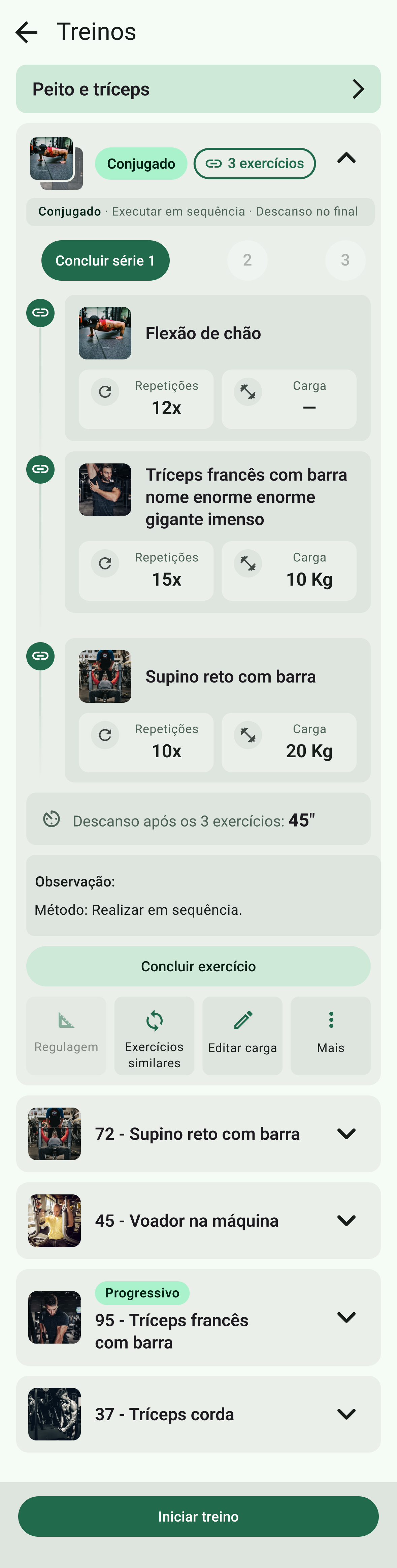
Individual blocks bring each exercise's name, repetitions, and load together. A connecting line shows that the movements belong to one routine, while the existing label and count remain as a compact overview.
Give every exercise an entry point
Each movement has its own thumbnail linked to a dedicated demonstration, so guidance is associated with the exercise it explains.
Explain sequence and rest in context
An instruction at the top establishes the sequence. The rest interval follows the movement blocks and explicitly states that it comes after all three exercises in this example.
- 01 Push-up
- 02 Overhead triceps extension
- 03 Barbell bench press
- Rest 45 seconds
The routine, in context
Working within the existing list
Set completion stays at group level, preserving a familiar control. Longer exercise names and method instructions can wrap without obscuring the execution details.
Ready for implementation
Updated Figma components and a revised master file incorporated the new patterns into FITI's shared design source. Annotations documented the interaction behavior for developer handoff.
From a labeled group to a readable routine.
The redesign brings the trainer's prescription into the workout list: each movement has a place, guidance is within reach, and the sequence is explicit.