CyberLabs Rebranding
Making one of the biggest AI companies in Latin America look the part.
The challenge
CyberLabs was at the brink of a huge influx of capital when they brought me aboard in 2020 as a Branding Specialist to revamp their corporate image, strategize our communications and socials and bring their visual identity up to par with their new place as one of the biggest AI companies in Latin America.
It was important to position ourselves as the company putting Brazil on the AI map, and also keep true to our hard-code computer science origins - so the branding concept was built upon that.
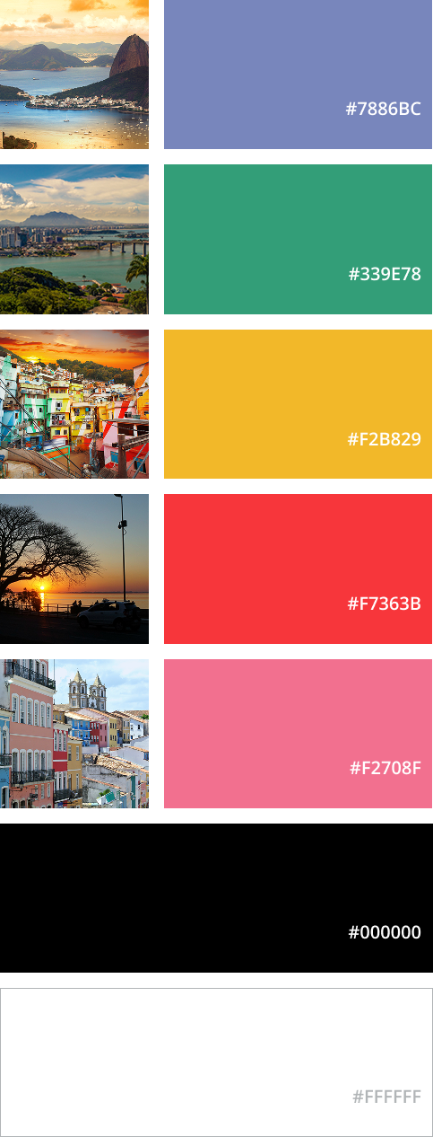
The challenge was how to convey the diversity and creativity that comes with such a continental country and showcase the state-of-the-art technology we were creating to and by Brazilians, with the goal of making AI accessible and usable to everyone.
A much needed rebranding
The branding
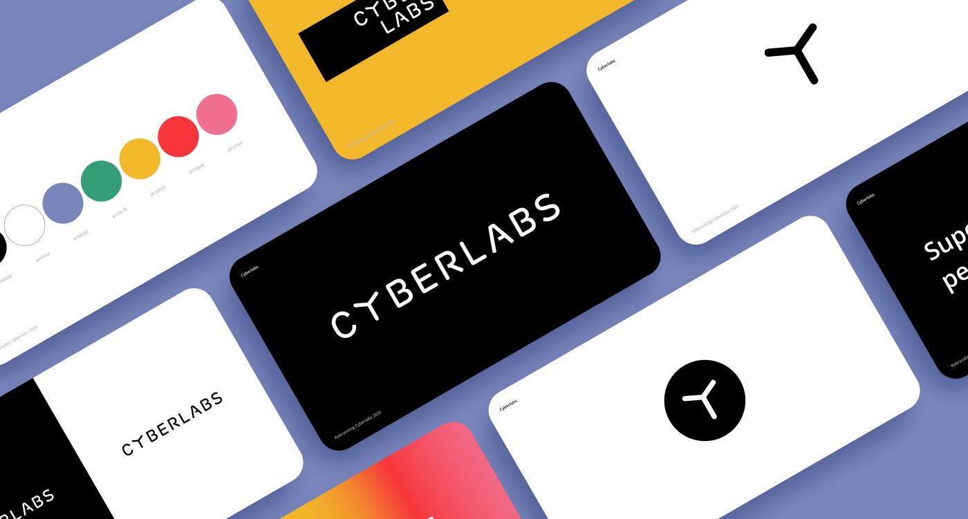
The company’s previous visual identity was attached to a kind of outdated imagery of the future - much like what The Future looked like in the past. To ideally communicate what we understand by cutting-edge technology and the state-of-the-art in AI it wasn’t enough to stop imagining the future of the past and start noticing the future now, in the present - we need more. We need to make the future present in everything CyberLabs does.



The logo that keeps on giving
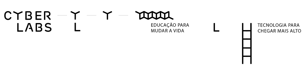
One important feature of the CyberLabs branding was the creation of a blueprint for future projects: with the possibility of iteration on the original visual identity to provide easy to make logos for one-off projects or future endeavors, we create a legacy for future design teams of the company.
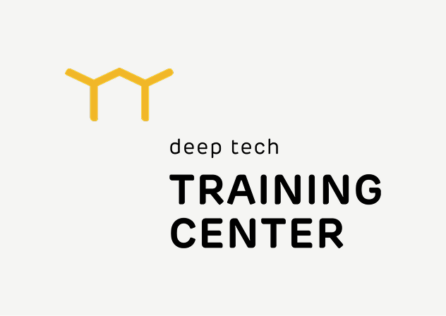
For instance, the logo of our Training Center Building, a project in itself, was created in this format.
Inspiration through experience
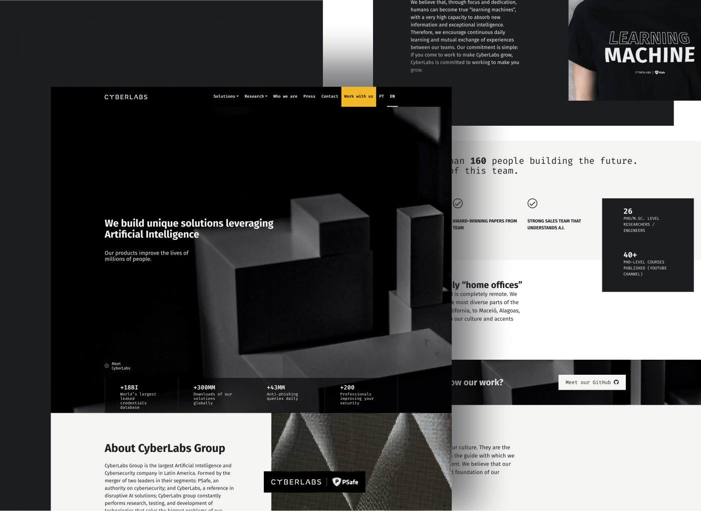
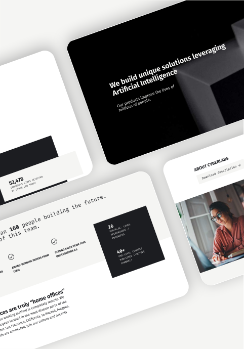
CyberLabs’s corporate website redesign had two main goals: attract new talent and dazzle investors. Check and check.
The challenge - again
After the rebranding delivery I was tasked by the HR team with the task of making a brand-new company website to better represent a new moment for the company: in 2021 after a merge with cybersecurity giant Psafe, CyberLabs became the CyberLabs Group with projects of both AI and Cybersecurity.
As senior brand designer responsible for web and look-and-feel across the group, I was to help with the difficult task of hiring tech talent: CyberLabs was making big and cool things, but the website was not showcasing all the cool projects, making it harder to hire highly specialized developers.
My second task was from the Marketing team to overhaul the basic corporate website that wasn’t exactly delivering a strong and attractive presence as a cool, legit and cutting edge tech company into a more visually appealing web presence to reassure investors, attract new ones and increase interest in our projects - and engagement on our socials.

Applied identity: Y we do it
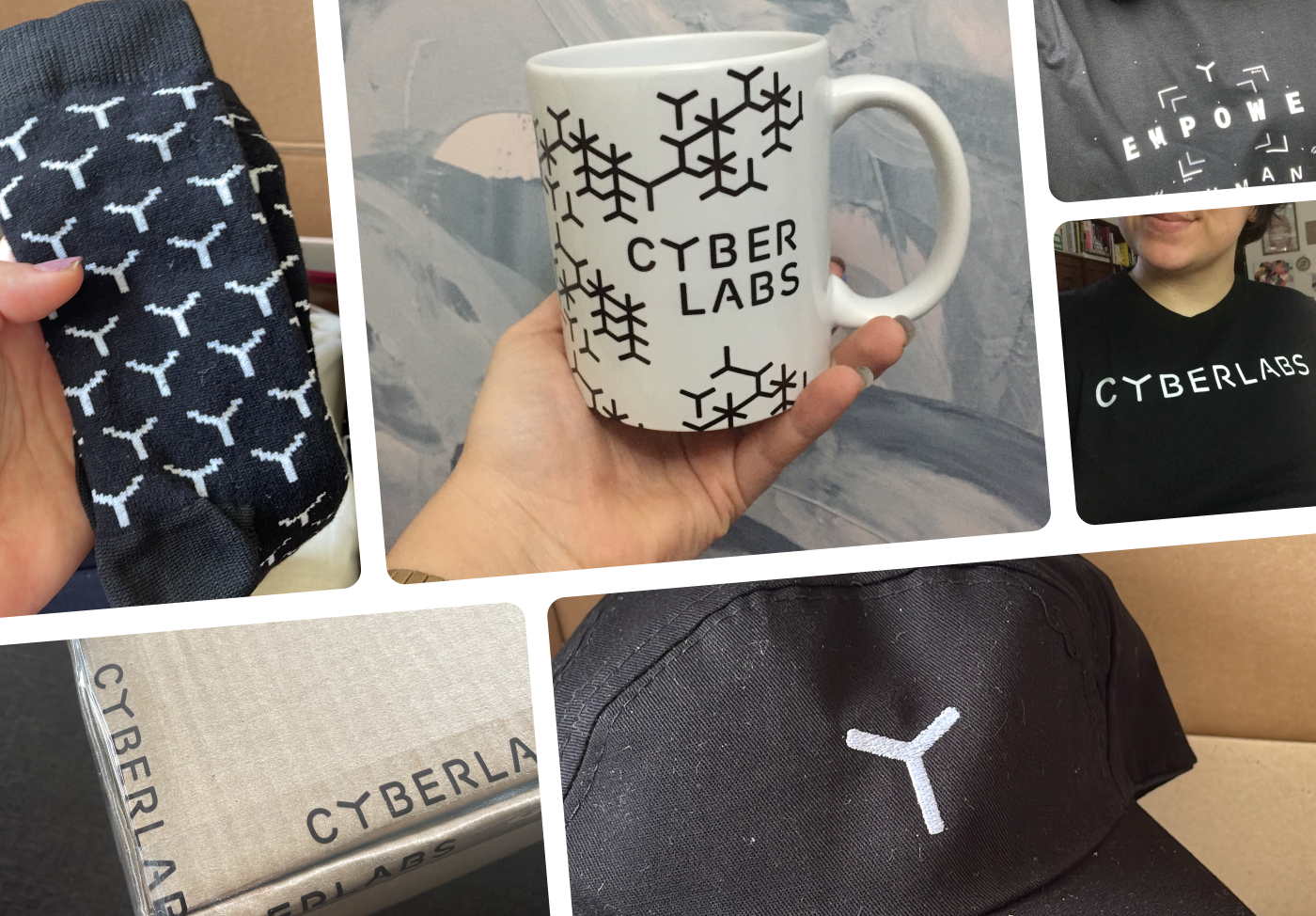
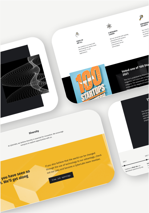
It brings me so much joy to make this branding into corporate swag as well as to see what CyberLabs’s People and Culture team come up with and know that not only the staff appreciates it, but they actually like and use the pieces.
It’s adorable to know the CEO wears a sock with the company logo on it - when you made the company’s logo :)